Localizing MÖRK BORG required a deft hand and a dedication to the details
An interview with Malstrom’s Montro on translation, new fonts, and how to create an aesthetic.

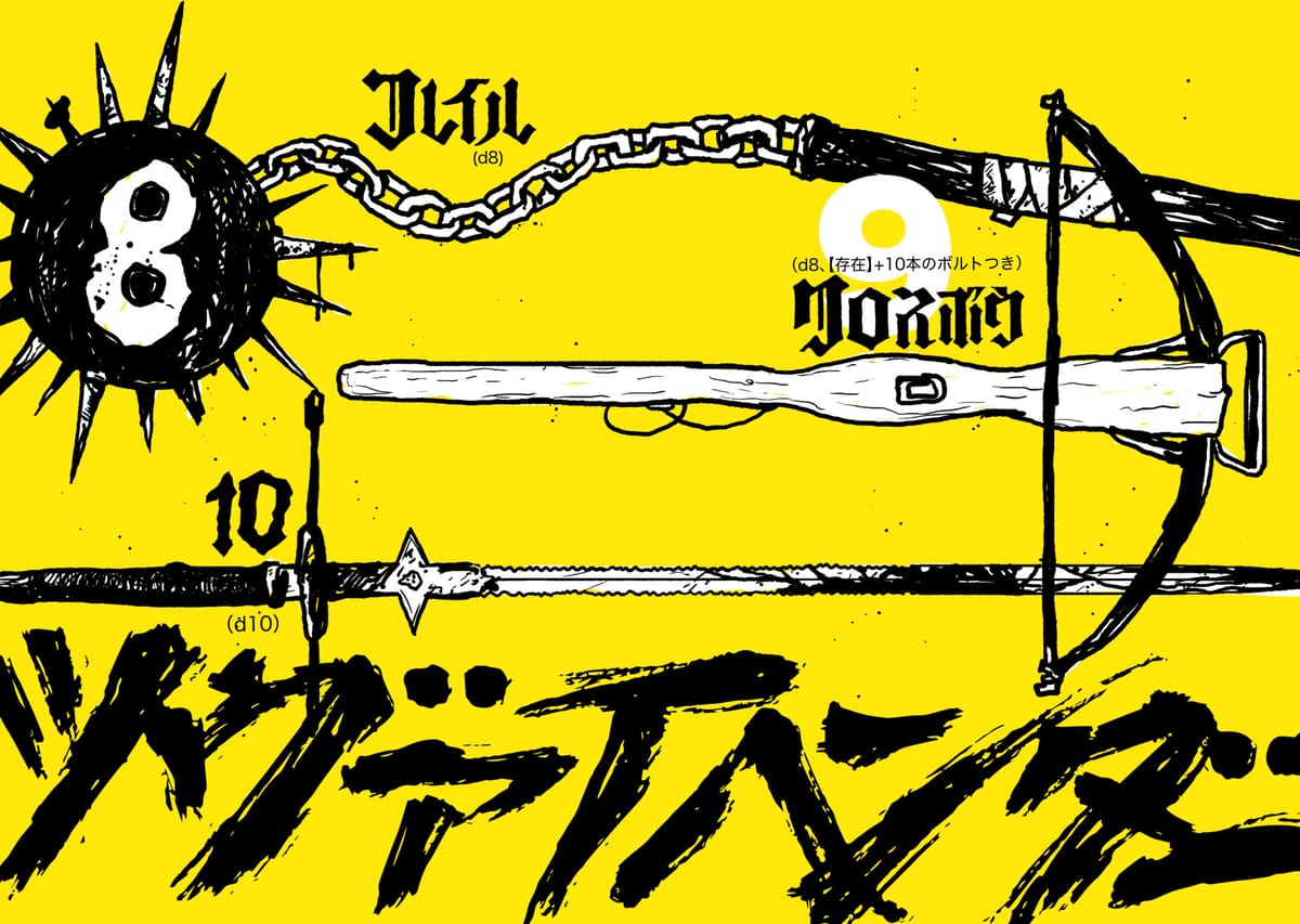
Only five years old, MÖRK BORG has become an instant classic in the tabletop scene, catapulting its designer, Johan Nohr, and publisher Stockholm Kartell, into the upper stratosphere of indie game design. [Nohr also designed Rascal’s logo, but we try not to hold that against him.] Inspired by classic dungeon crawls and heavy metal, it rose to popularity for its lightweight, but evocative ruleset, the emphasis on play-to-lose characters, and its often imitated, but never replicated hardcore graphic design aesthetic. When Yuhei “Montro” Imabeppu began to work on a Japanese localization of the Swedish game, it was precisely imitating this design aesthetic that proved to be one of the most difficult challenges.
While gothic lettering and heavy blackletter fonts have a long history in Latin Script, it’s a far newer phenomenon in languages that use kanji. Montro didn’t just have to source these hard-to-find fonts, but, in some cases, had to make them himself. Combined with differences in emphatic grammar and layout structures, Montro had to be exceptionally careful with the Japanese localization. The result, however, is gorgeous.
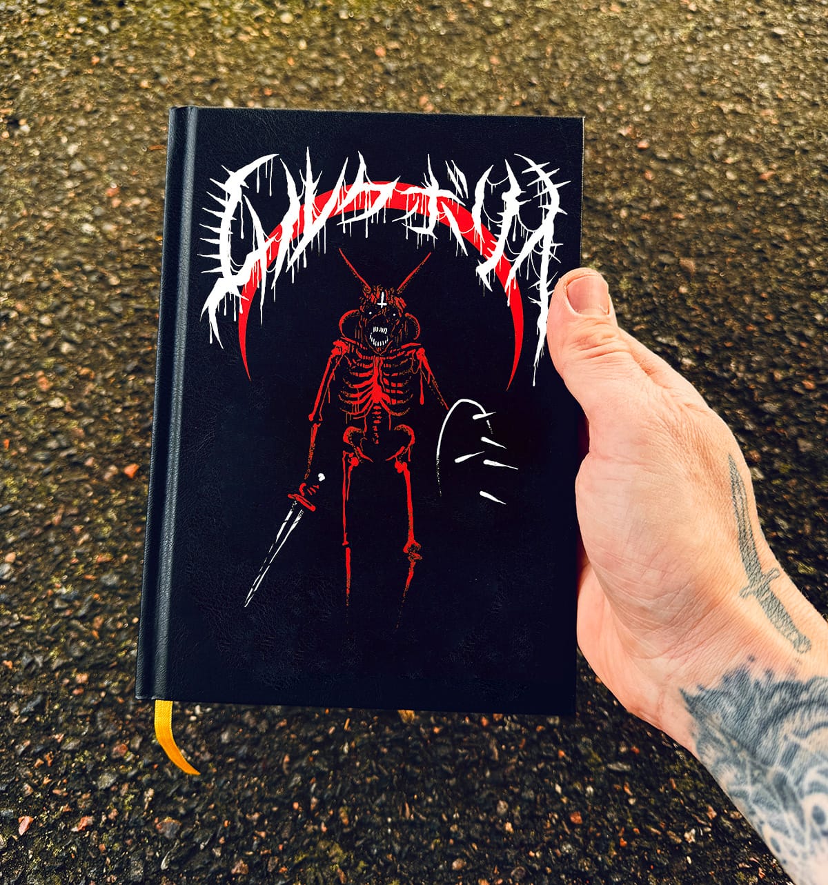
The already-funded crowdfunding campaign is a testament to just how great this book looks and how much time was dedicated to the design and translation. We were able to land an email interview with Montro to talk about the nuances of the design and collaboration process.
This interview has been edited for length and clarity.