DONE Now on Kickstarter
A peek into the process of cover designer Robbi Burns

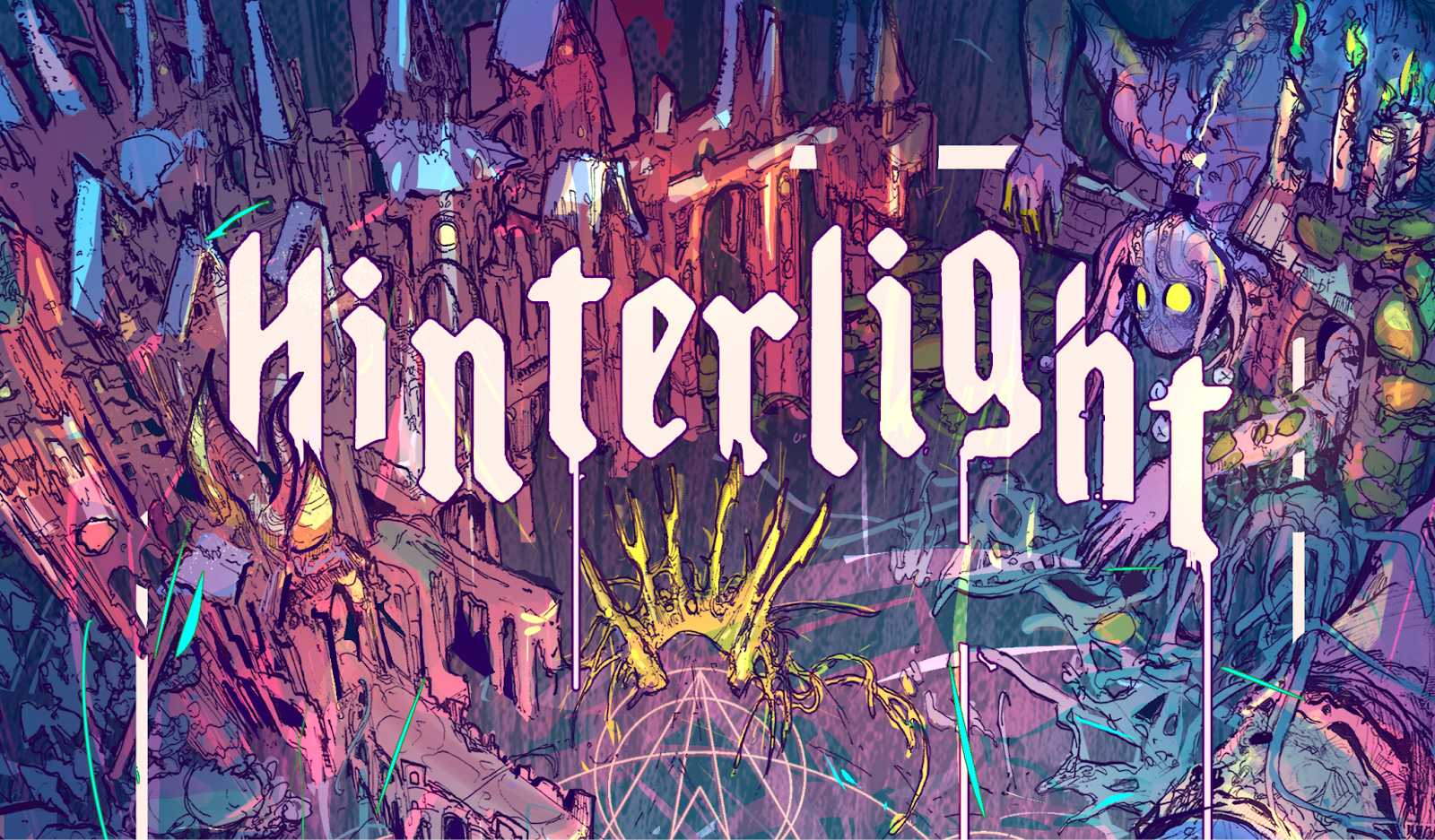
Hey hey! I’m Robbi Burns, a freelance illustrator working in the TTRPG industry! I’ve done art for Prince of Hounds, What a Horrible Knight, Defy the Gods, Goodman Games, R Talsorium, and more. Today, I'm sharing a bit about creating the cover for Hinterlight.
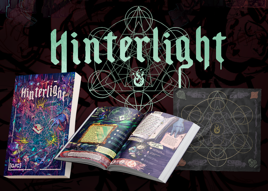
Hinterlight is a GM-ful, straight-to-table world-building ritual game that's set in the ashes of a gothic fae empire. You start the game as one of four recently (and horribly) deceased adventurers sitting around a table, remembering how you died. With evocative prompts and suitably grim art, you brainstorm who you were, the fae world that killed you, and how you met your tragic ends. If that sounds like something you’d be into, the Kickstarter is live, baby!
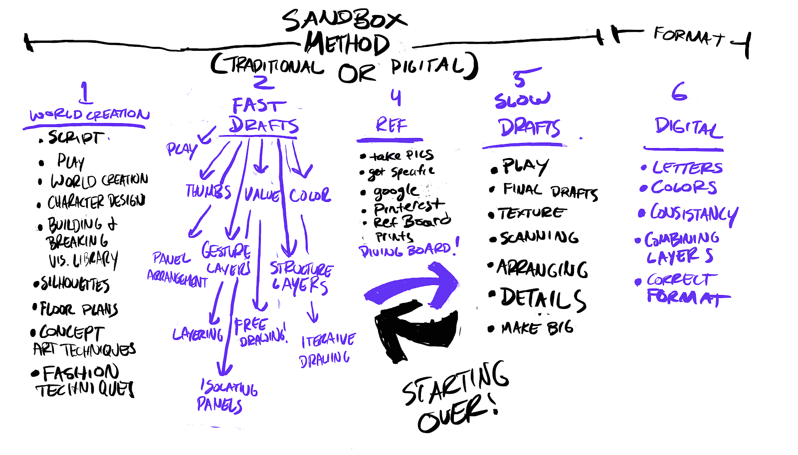
People can always tell whether a piece of illustration was fun to make, so here's a breakdown of the process I tend to use for the express purpose of keeping my work spontaneous and playful looking:
As we were getting ready to launch the Kickstarter, I realized we needed an illustration for the cover. Thus begins phase one of my method: concept development. I already had this idea about using the table that the ritual is cast on to illustrate a top-down, wildly fluid cacophony of thematically appropriate areas. I wanted to visually represent any number of ideas that players could have invented. The primary components that I absolutely needed to display are:
- Some representation of the Dwell (the fae forest that kills you)
- A possible stand-in for Rhyme (The crumbling manor in which the Noble Fae (and soon the players themselves) abide.
- And some landmarks, to represent future adventure locations within the forest.
- Little beasties for sure, maybe even a fae freak would be cool.
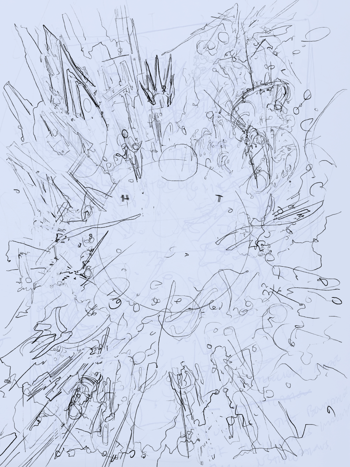
Next, begins the sketching phase. Though I was traveling on the convention circuit, I had my iPad and the impulse to get started. I almost never use Procreate, so I thought, maybe I’ll just play around on there in an attempt to make some cool shapes in a composition that I could use. It didn’t go well, but at least I got some fun ideas out of it!
My internal dialogue sounded something like:
Can I just… I think I want to just sketch a little bit first? Maybe I could even collage something out of previous sketches to make a master sketch I could work from. It’s never really worked like that before, but it sounds fun, right?! Let’s just get the juices going, and see what comes of it.
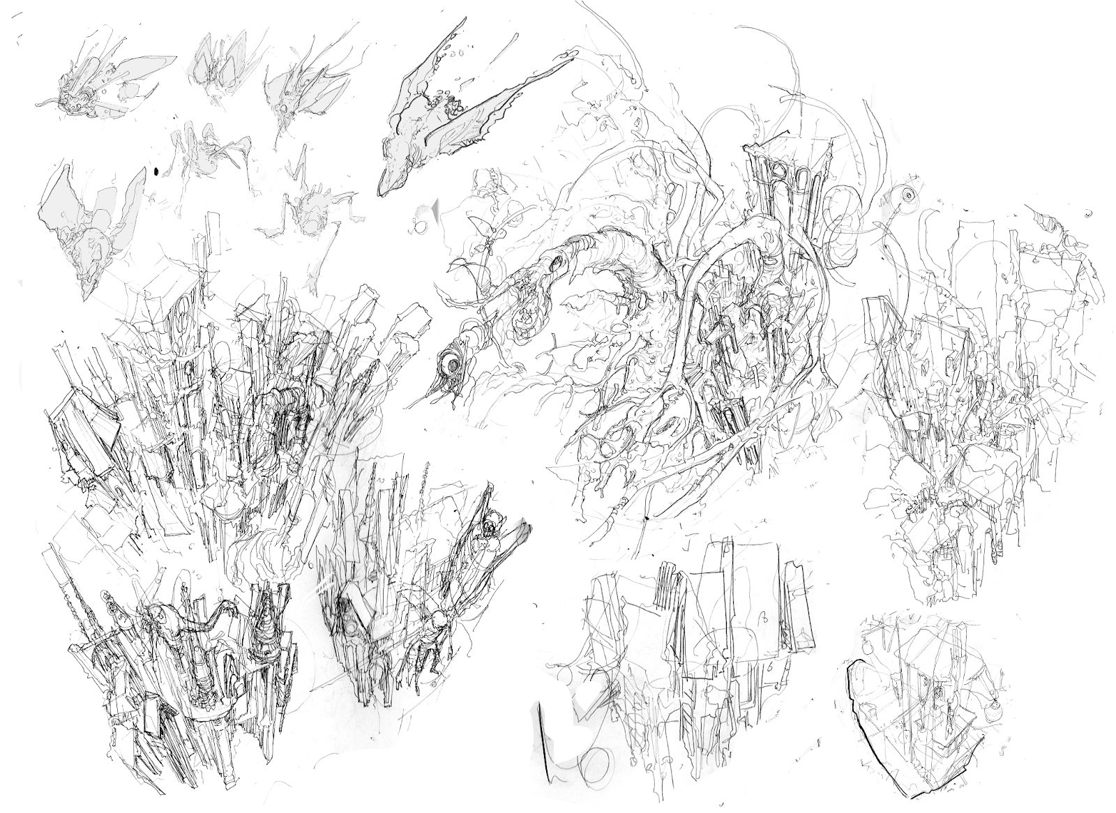
Oh hey! What a mess, though! There are maybe a few useful tidbits that came out of this, namely some fun monsters and a few shapes that I wound up iterating out of existence. The point here is to find the fun. If I know that nothing useful will come out of this, then I’m more likely to treat it like a little sandbox where it’s okay to fall in love with the details without it turning into a disastrous waste of time.
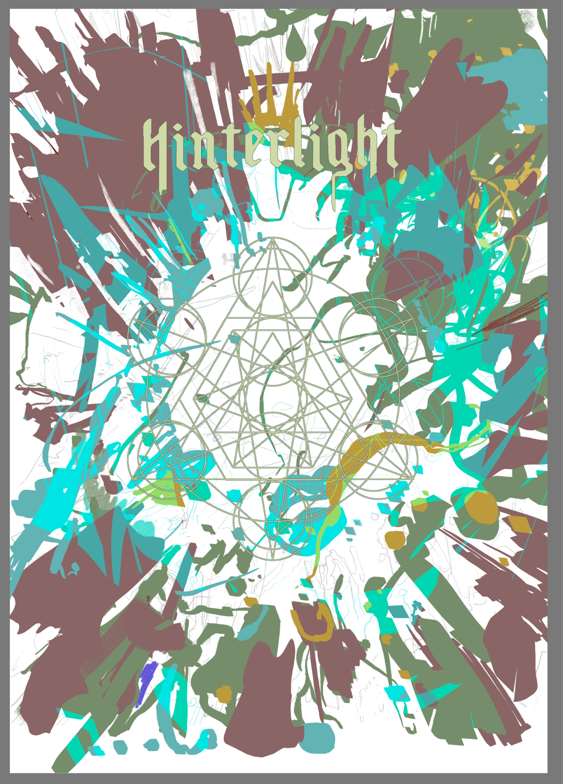
After I got home, it was time to scan in some sketches and attempt to turn them into some seriously cool-looking shapes. I stuck to three major layers of shapes, and turned on a stroke setting so I could fake like I was doing some sort of linework pass that I could print out and use a light under my glass desk to trace into an actual ink draft.
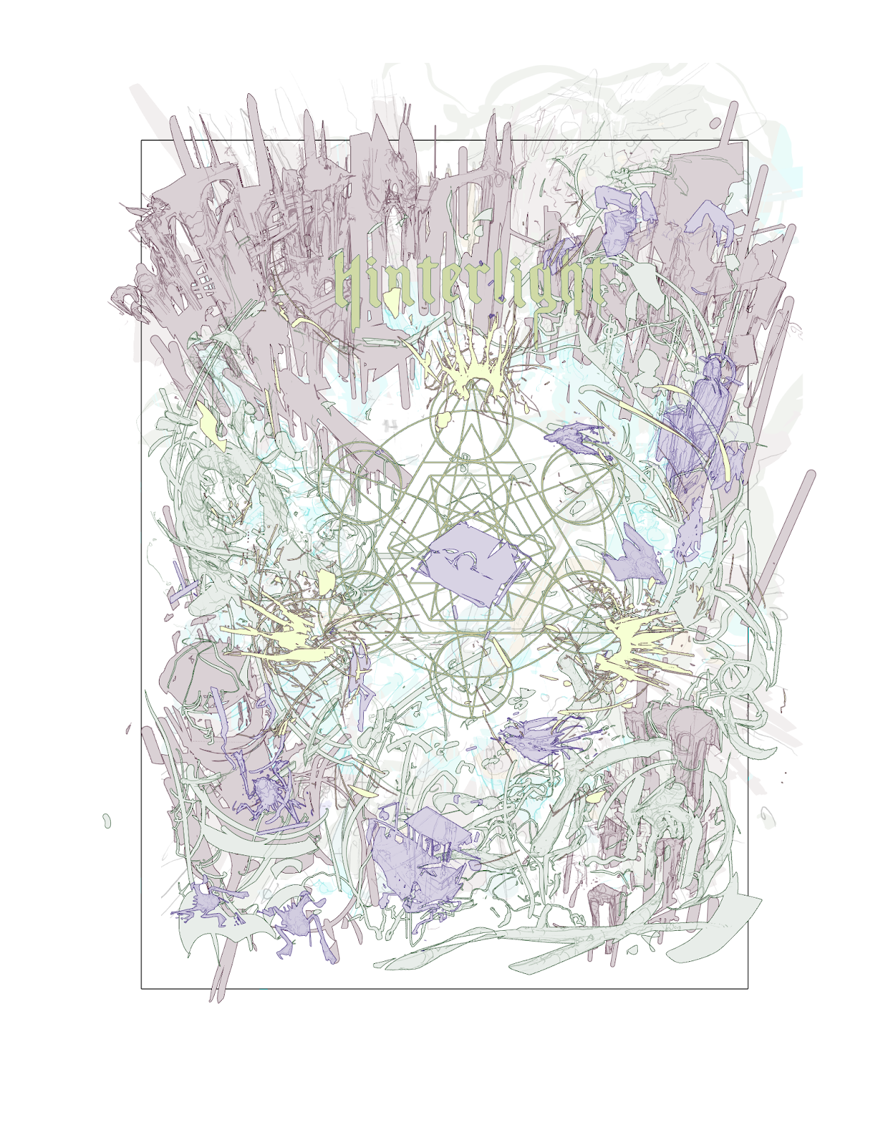
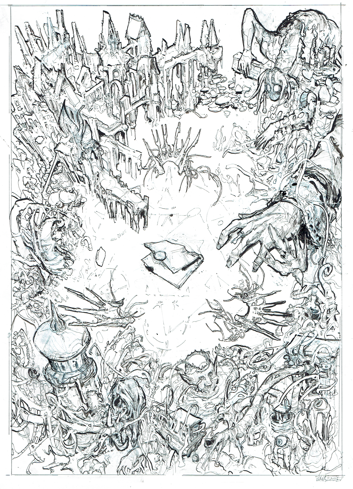
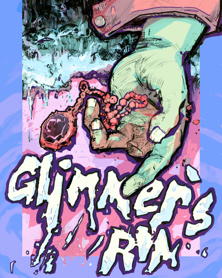
If you haven’t caught on, I like to switch between focusing on lines and focusing on shapes with every successive pass of my drawing. You can’t get too comfortable, though, especially with a composition as overloaded as this. You always have to be careful that you aren’t losing energy between each pass, and that every element continues to serve the piece while being on the lookout for ideas that could help push things even further in the direction you want to go. In this case, I needed to have some larger shapes guide the eye and add more size variation, so I decided to make a giant fae jester creature and add a giant hand on the table to represent one of the corpses. Added benefit: I could use the hand to Easter egg our first big project, Glimmer’s Rim. Shhhh!!!
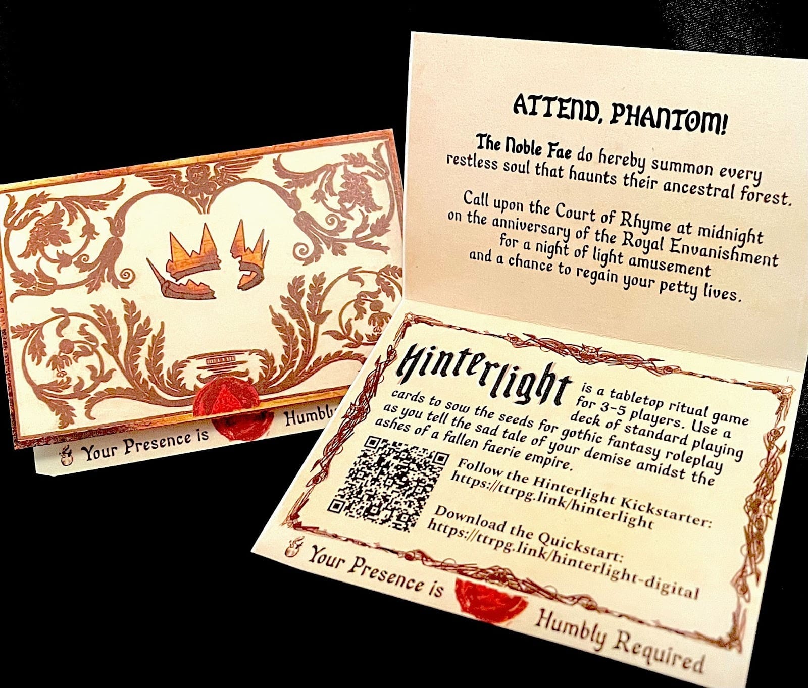
I also needed a focal point, so I turned one of the invitations that we’ve been passing around conventions to hype the game into a diegetic artifact!
After that, coloring is pretty low-pressure as everything can always be tweaked. After trying some crazy color combinations, I finally decided that I shouldn’t mess too much with the success of the original Quickstart cover, so I decided to try applying the pink/purple/blue. Hell, and while I’m at it, let’s grab the frame idea too! Tyler and I got our start doing comics, and I was never able to let go of how rad a good panel break can be.
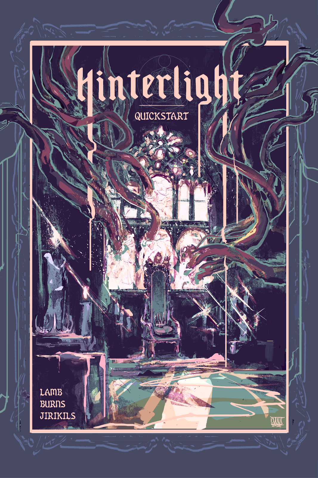
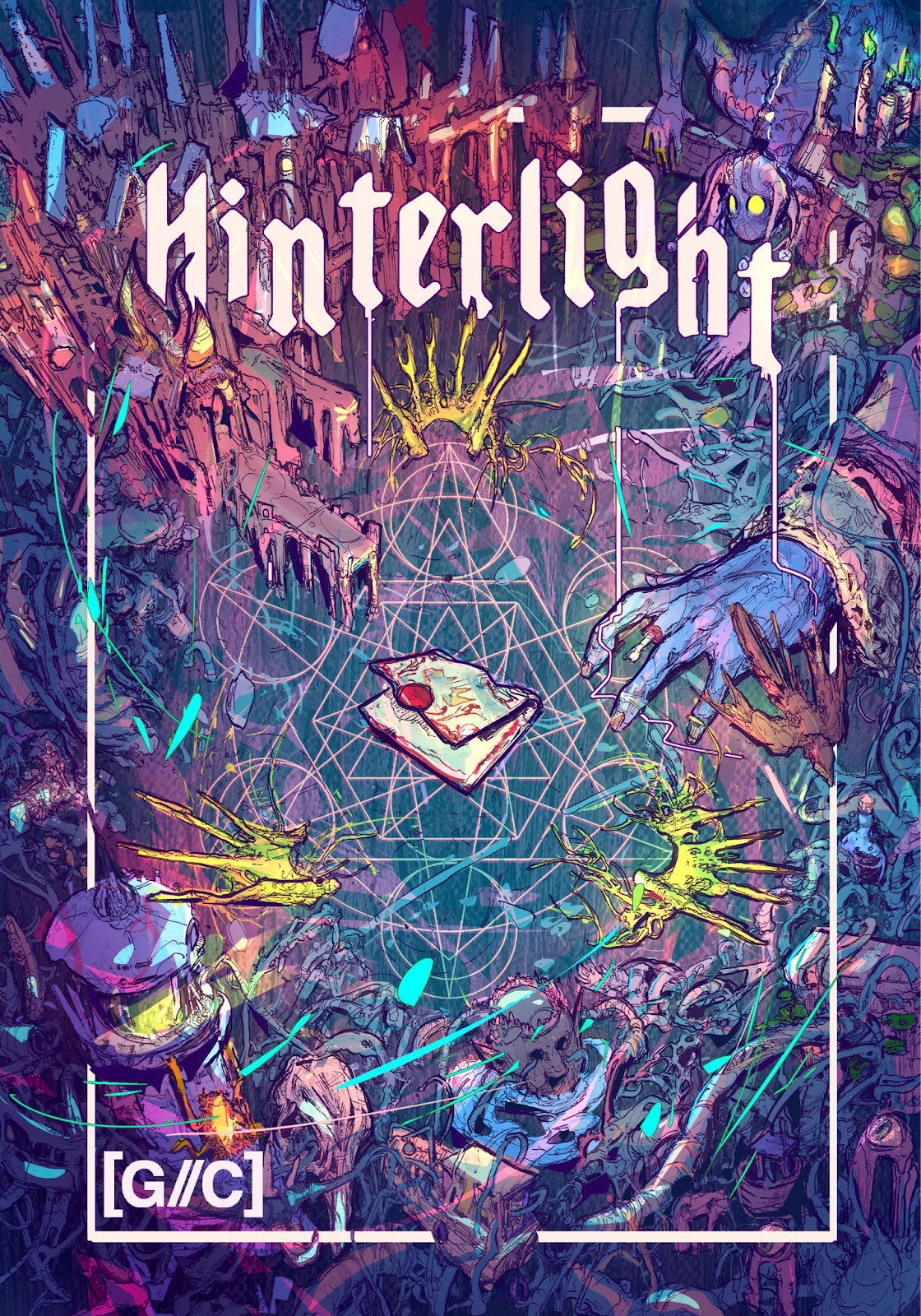
So there we have it, albeit it wound up with way juicier colors than the original Quickstart. It just felt appropriate. If we’re being honest (which to my detriment I usually am) I’ll probably take the flattened cover and do some pushing and pulling to blend in the line art a bit more with the color, but I’m fairly happy with where it’s at.
On behalf of Gossamer Coast and Plus One Exp, who is publishing this dang thing, thanks for reading! If you’re interested in vibing the game first, make sure you stop by the Plus One Exp website and grab a copy while it's free!